Resource Booking System for Teachers
Booking a room shouldn't take this long
Teachers often face challenges when booking classrooms and equipment for their courses. Existing booking systems can be time-consuming and require users to navigate multiple pages before finding a suitable room. This project explores a more efficient and user-friendly booking experience.
- Allow booking of three rooms.
- Ensure each room accommodates a minimum of 20 participants.
- Ensure all selected rooms are located within 500 meters of each other.
- Allow the same rooms to be used for multiple exercises.
Working out the booking logic first
Built to work out the booking logic first: search by room type, equipment, building, date, time and seats — with multiple rooms, multiple dates, system-suggested rooms, and managing bookings. All components in the Figma prototype were created from scratch. The logic starts by asking the user what, where, when.
Where people got stuck
I tested the mid-fidelity prototype with five users to understand how they used the room booking system and to identify where the experience became difficult or unclear.
Every finding gets an answer
Each decision responds directly to a numbered finding or gap from Usability Test 1.
From findings to a working interface
Usability Test 1 surfaced both interaction problems and gaps in the booking experience. I used Claude Design to move quickly from those findings to this high-fidelity prototype — directing decisions, reviewing what it produced, and refining it. It includes the design responses above, but has not been tested yet.
Choosing an option completes the step and moves to the next field. Recommended rooms appear below the search bar as requirements are selected.
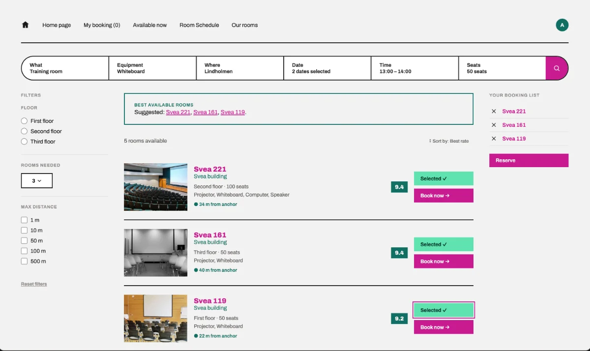
The best available rooms that match the selected requirements.
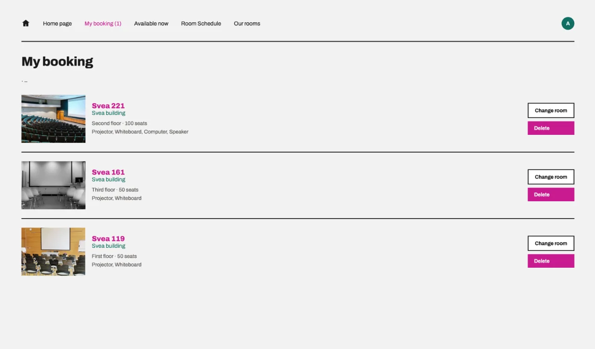
Where teachers see and manage the rooms they have booked.
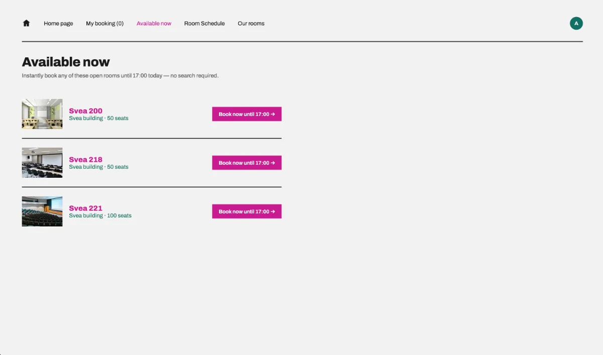
A new page in the navigation bar for finding a room that is free right now.
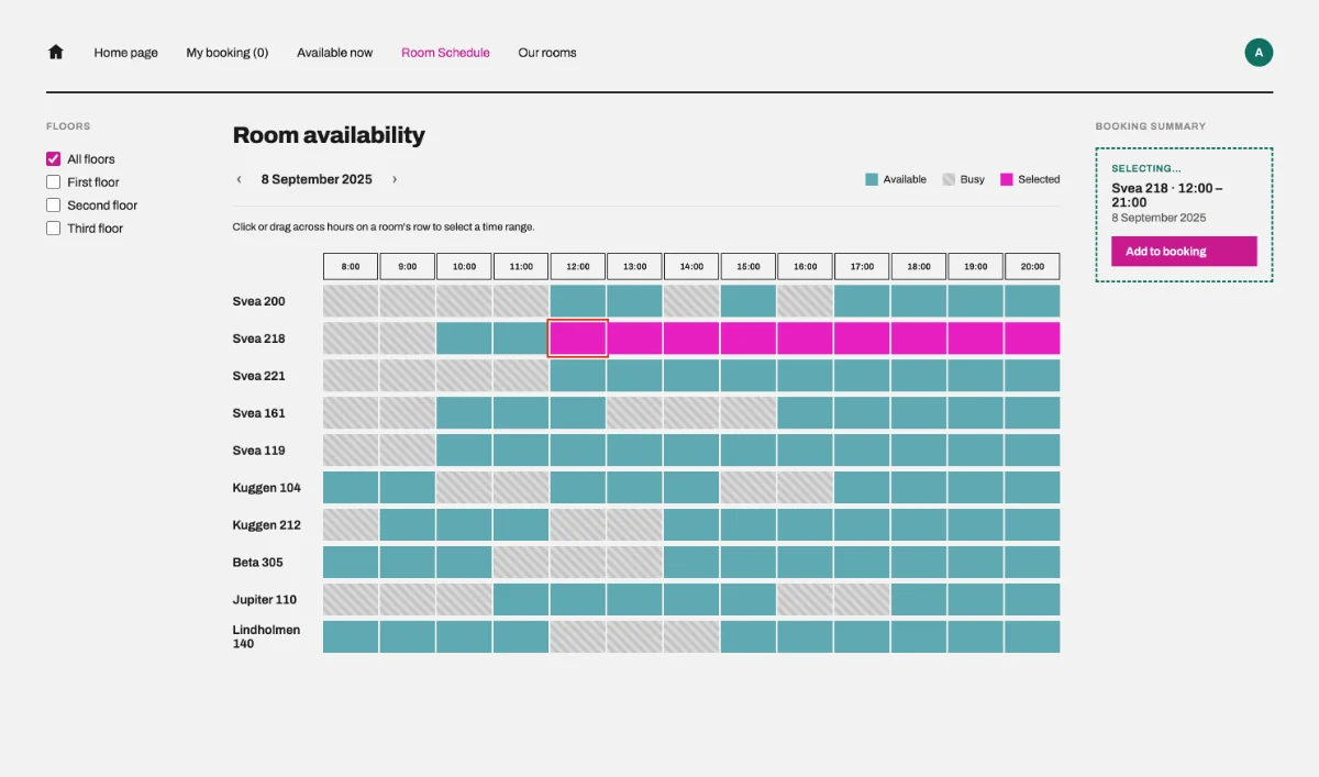
Rooms with their available and busy times. Start and end times are picked directly from a room's timeline.
Faster from insight to prototype
Claude Design shortened the distance between a usability finding and a testable interaction. I directed the decisions and refined the result — it didn't design the project for me.
Paused before the second test
The project is paused here. I need to test whether these changes actually work better before making further iterations.