An Honest
Interface
What if Polestar's in-car interfaces showed the environmental impact we usually don't see?
Range and speed on screen, impact on paper
In this project, I designed an honest interface for a Polestar car — one that shows the hidden environmental impact of using an electric vehicle. The goal isn't to offer a solution, but to encourage drivers to reflect on how their driving can affect the environment.
I used a Critical Design approach because it helps question what already exists and creates space for reflection and new perspectives.
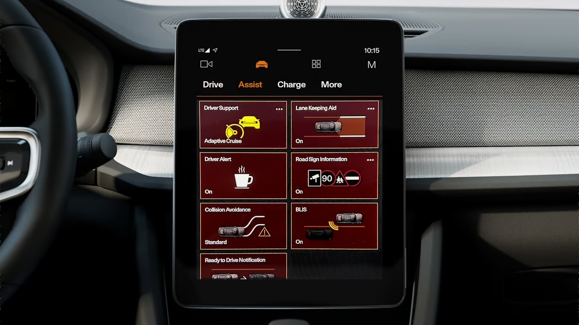
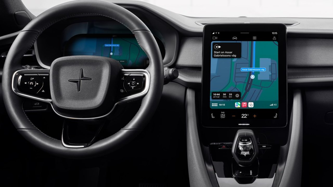
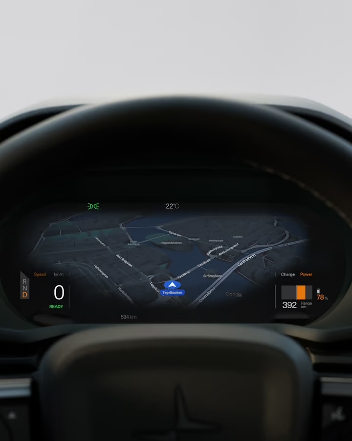
Polestar shares information about the environmental impact of its electric vehicles in its sustainability report, but this information is not visible in its in-car interfaces. The center display, driver display, and head-up display mainly focus on information such as driving, navigation, speed, and range.
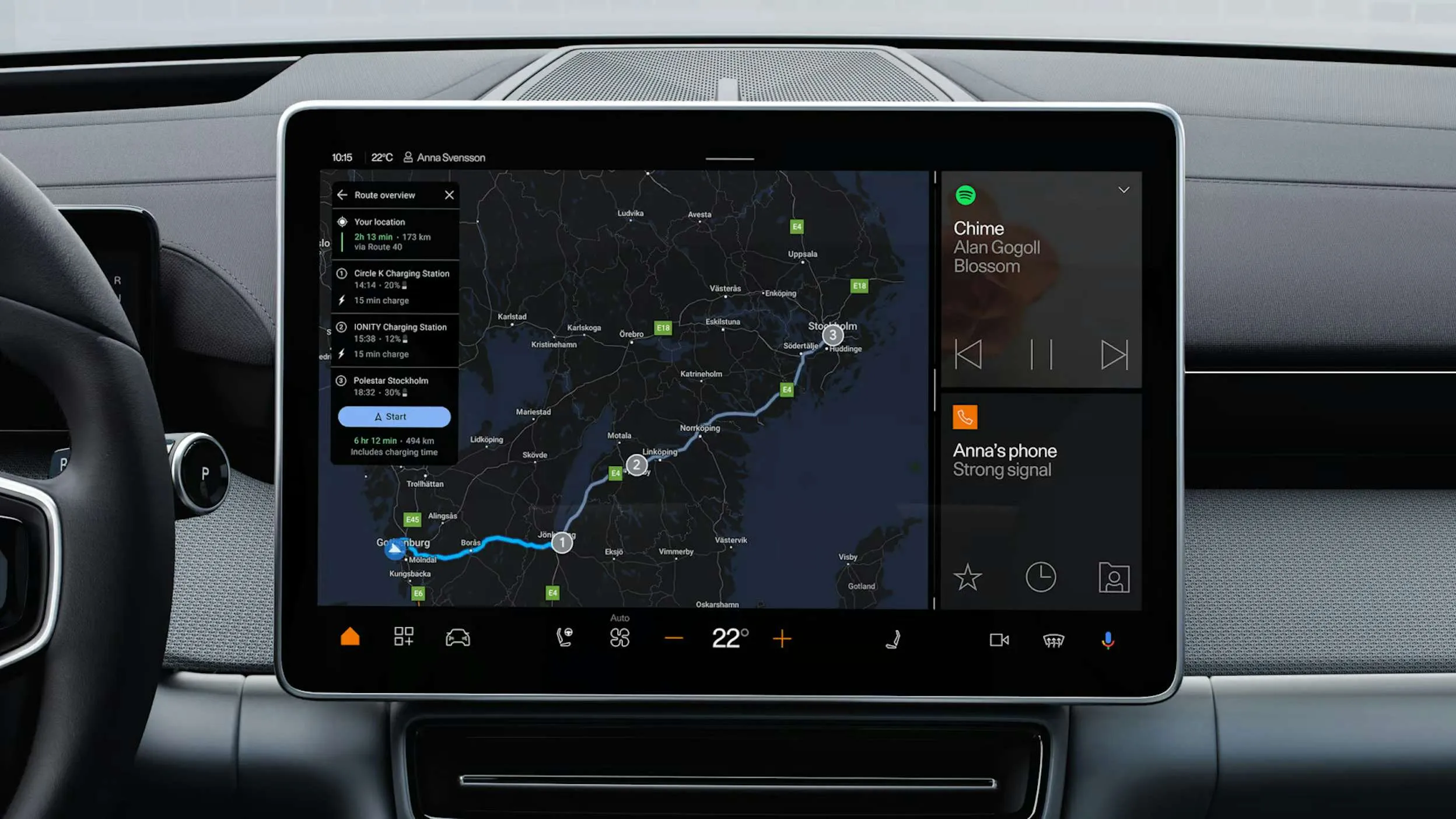
For example, when planning a trip from Gothenburg to Stockholm, the navigation interface does not show information about the environmental impact of the trip or encourage the driver to consider another way of travelling. This became the starting point for asking: what if the car interface also showed the environmental impact we usually don't see?
What Polestar's sustainability report revealed
While reading Polestar's 2024 Sustainability Report, I found the information that shaped this research. Polestar performs better on climate action than other car companies, which is why I focused on Polestar rather than another manufacturer. CEO Michael Lohscheller reported a 25% cut in relative carbon footprint per car sold since 2020 — about a quarter of all emissions per car sold.

"Polestar 4 isn't just our fastest car to date, with a 0–100 acceleration of 3.8 seconds, it also has the lowest carbon footprint of any Polestar car." — Polestar, 2024
Even with Polestar's transparency and its efforts to build greener cars, the company still makes vehicles built for fast driving — and fast driving increases tire wear, particle emissions like microplastics, and air pollution. The same report shows that making EV batteries releases toxic chemicals and heavy metals during cobalt, lithium and nickel mining, and that EVs also produce emissions from brake dust and tire wear, not just from the exhaust.
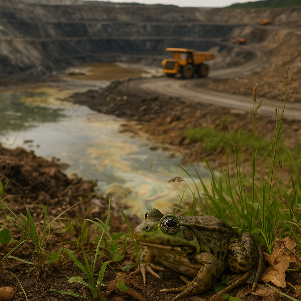
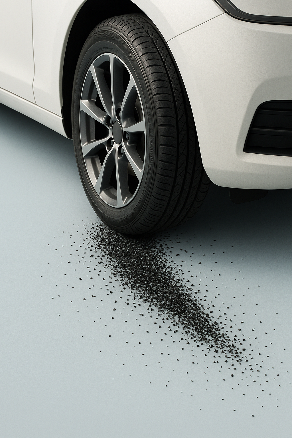

The gap between paper and screen
Everything the report tells you, the interface hides.
Polestar is honest about its environmental impact on paper, in a 60-page report almost no driver will read — but says nothing about it on the one screen every driver sees, every trip. That gap between what's disclosed and what's displayed is the real design opportunity: not a new feature, but a missing layer of honesty in an interface that already has room for it.
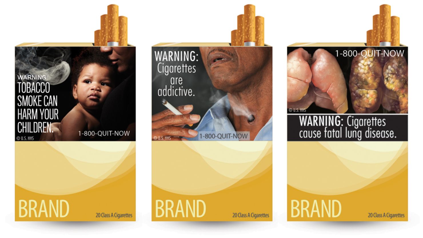
The closest example is tobacco packaging: warning images of sick people, printed on the box, required by law but honest about what they showed. It doesn't stop anyone smoking, but it puts the truth in front of you at the moment you use the product. That's the model for this project.
How the car should speak
A dialogue between driver and car — not a warning, not a lecture. The car gently points out the consequences of driving, without restricting, judging, or demanding attention.
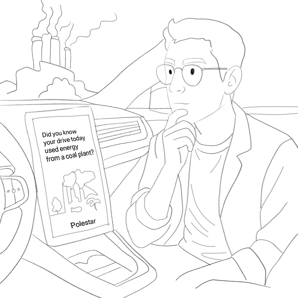
Instead of a warning light, the interface asks a quiet question: did you know your drive today used energy from a coal plant? No alarm, no lock-out — just information the driver didn't have before. The driver stays in control; the car just stops pretending the choice has no cost.
The interface works like an honest mirror, using symbols and short cues to make the driver pause and think: "Am I contributing to harm without realizing it?" That led to three moments where the car already has the driver's attention: while driving, before a long trip, and at speed on the head-up display.
Malpass (2013): critical design creates distance between the object and the user, making room for reflection. Dunne & Raby (2001): design shouldn't only serve the market — it should also ask, "can we live differently?" Wakkary & Odom (2018): technology that lives alongside us, slowly building awareness without demanding attention.
Building a believable Polestar display
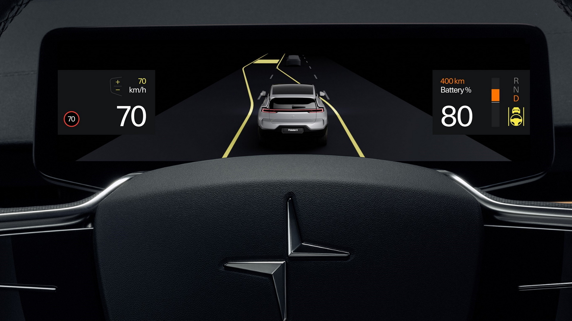
Making a realistic mockup of a Polestar driving display was a technical challenge — I solved it by drawing over a photo of the real display in Photoshop, using a digital drawing tablet. Getting the critical message across without being too harsh was another challenge, solved by choosing a cartoon style over real photos of dead or sick animals — closer to a warning label than a graphic image.



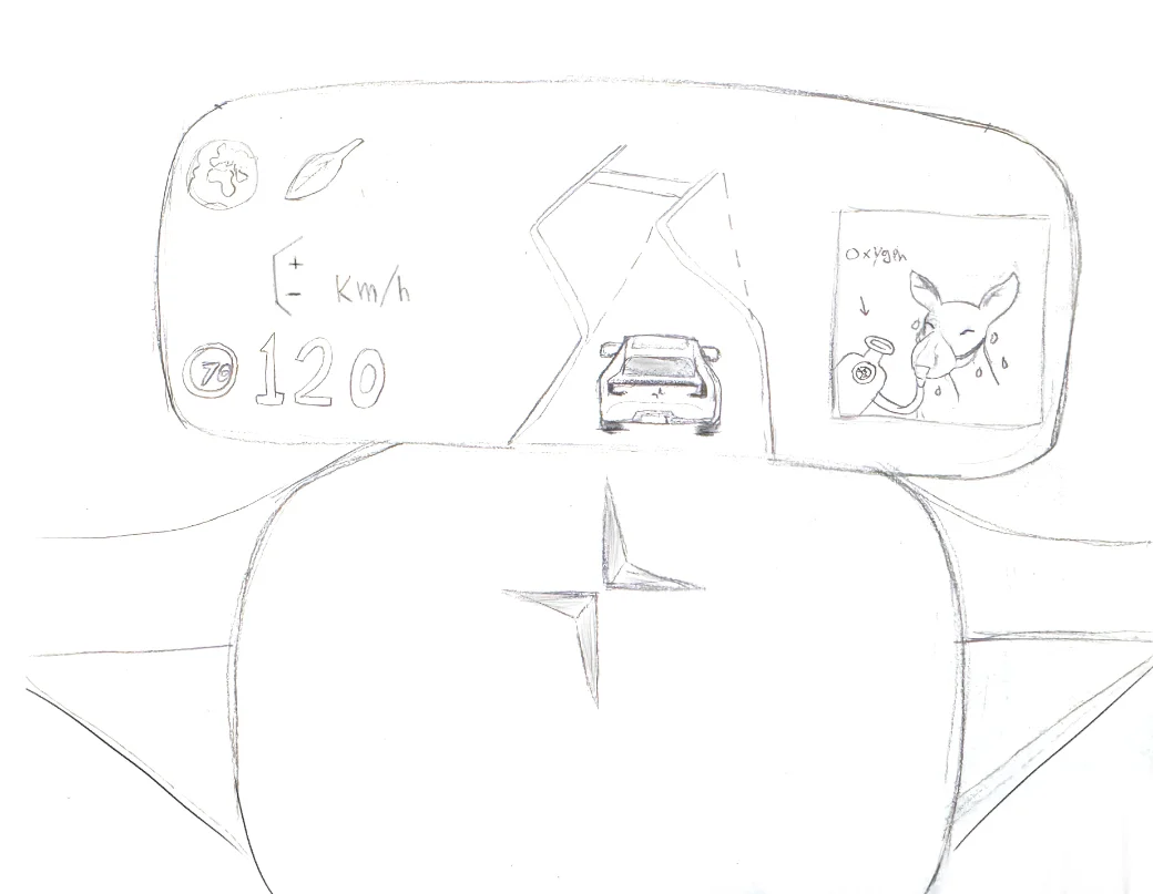
Early sketches of environment symbols — a planet and a leaf, on paper. A deer breathing with a mask and an oxygen supply. Digital driver display in the Polestar.
Where and when the message appears
Three moments, not one screen
Instead of one single warning, the message meets the driver where their attention already is: quiet while driving, clearer before a trip, and pointed at speed — so it feels like feedback, not an alarm.
Illustration over data
A tree losing its leaves or a struggling animal gets the point across faster than a number would, and keeps the tone reflective rather than harsh — closer to a warning label than a dashboard alert.
Cartoon over real photos
I considered and rejected using real images of dead or sick animals — the goal was to make people reflect, not upset them. A cartoon style keeps the message clear without being aggressive.
Three scenarios on real displays
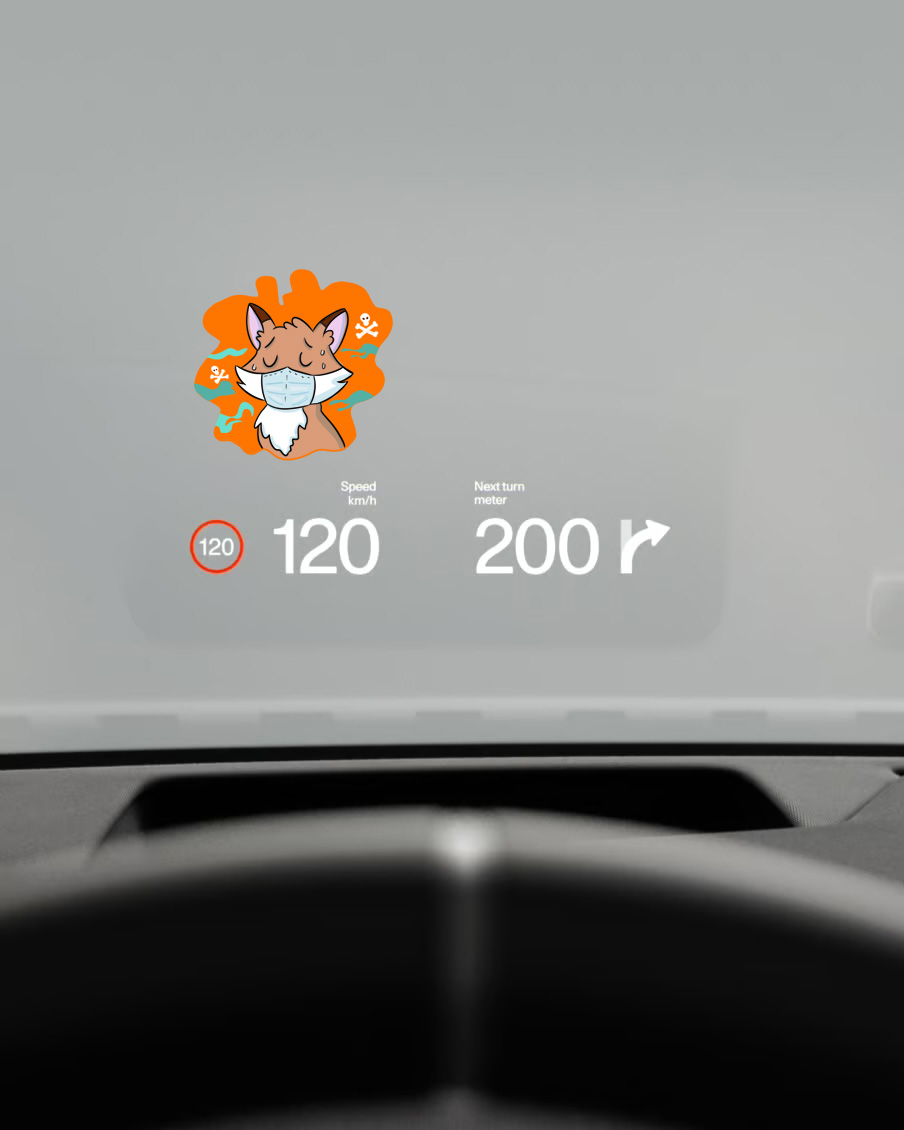
Three scenarios, composited onto real photos of Polestar's in-car displays, showing the same interfaces with one honest layer added.
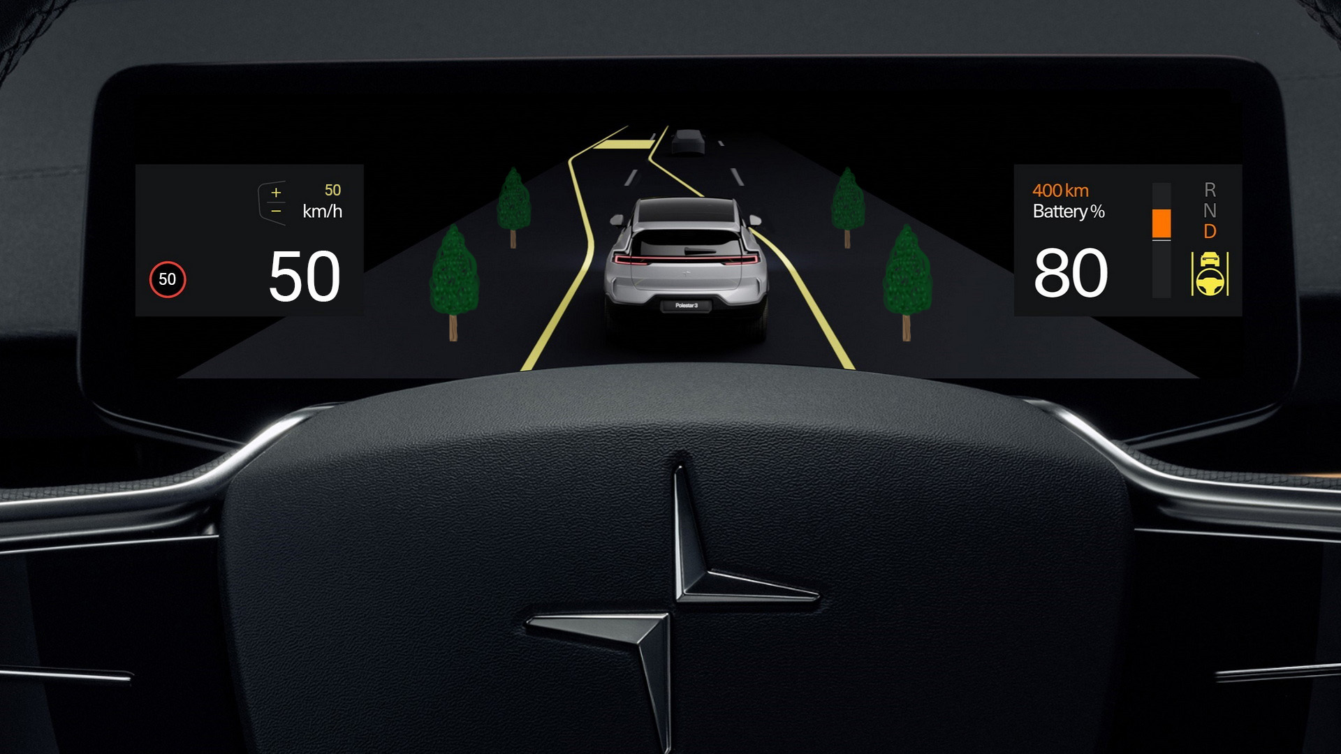
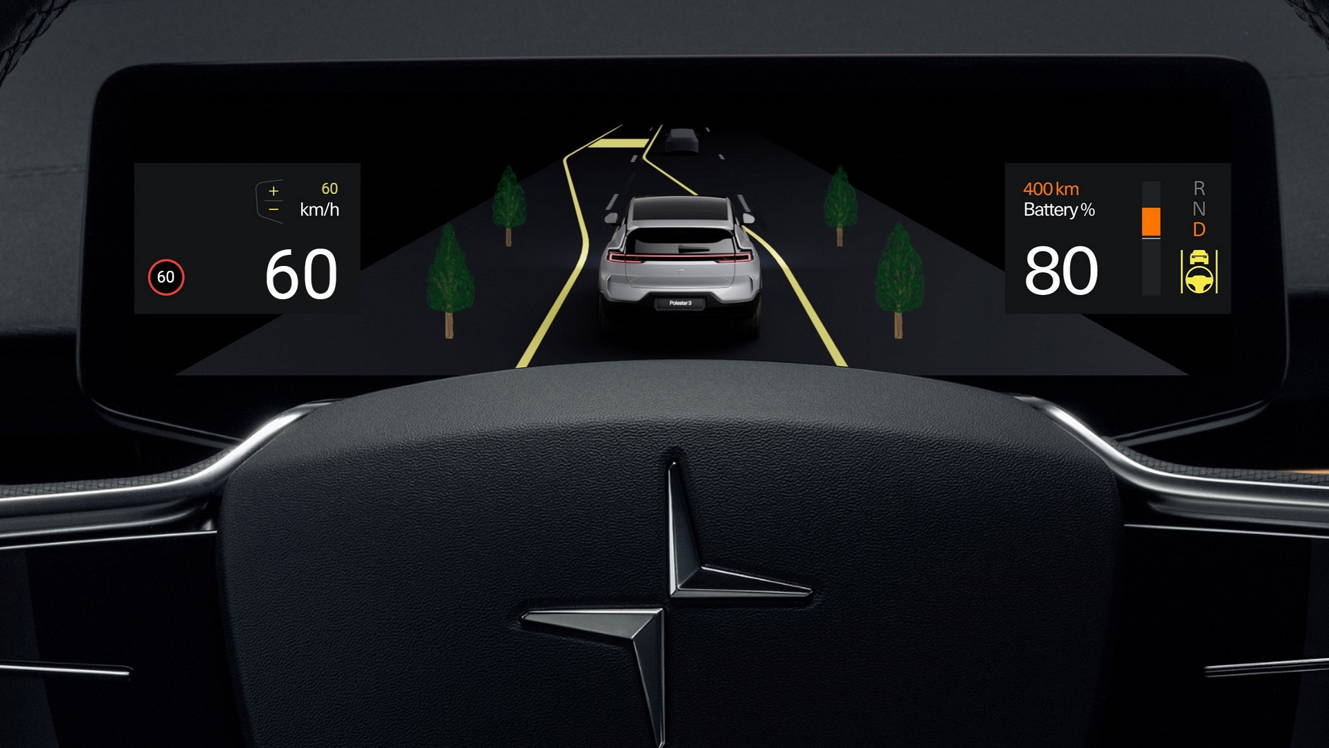
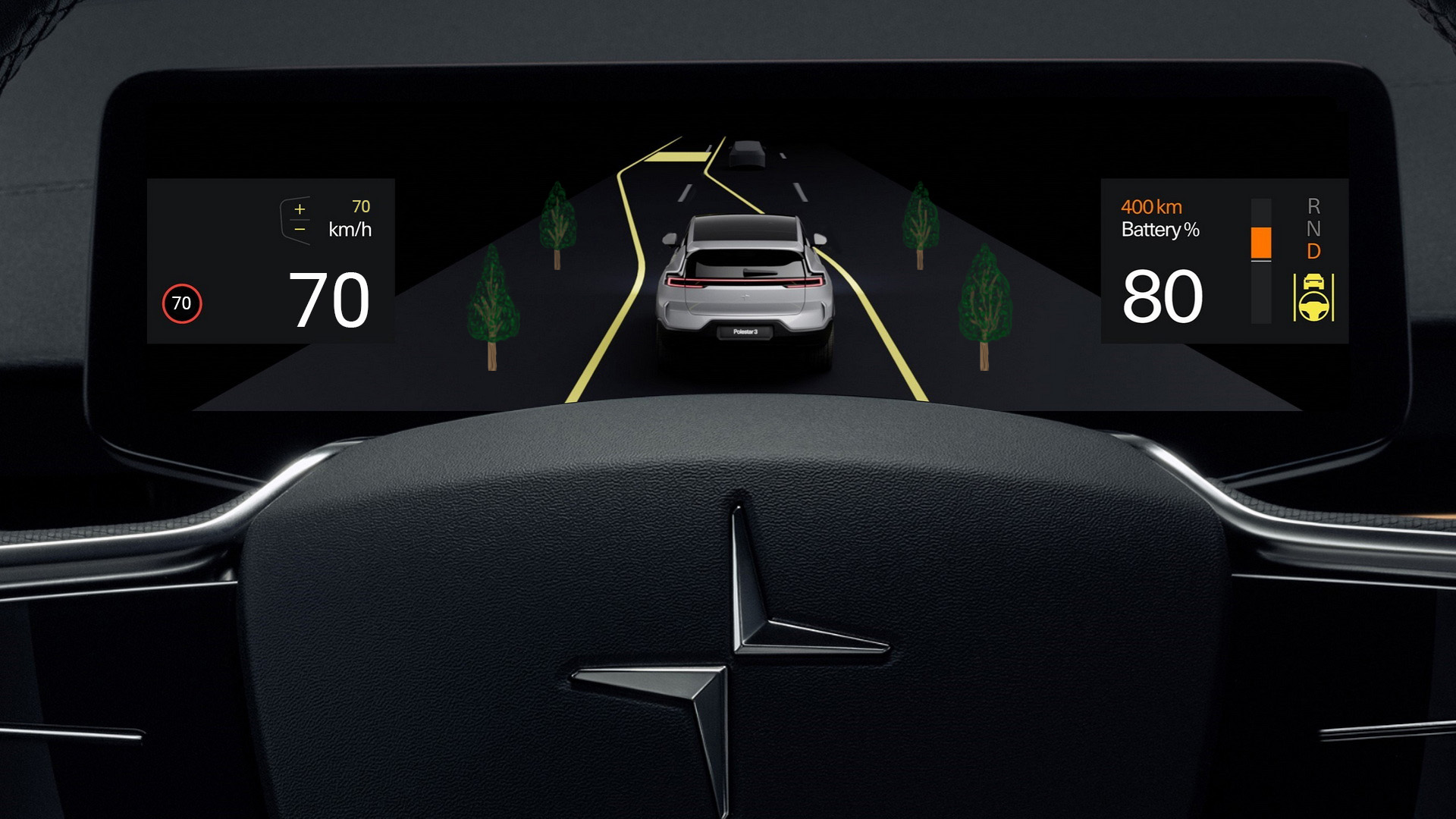
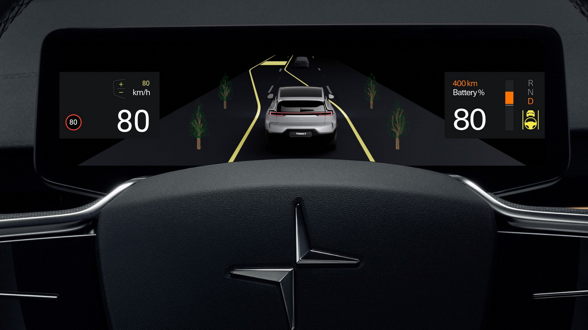
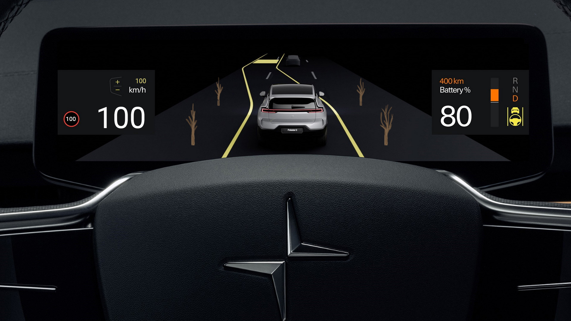
Below 50 km/h, green trees appear on the dashboard. As speed increases, the leaves start to disappear — a visual readout of damage, tied directly to the driving behaviour causing it. Giechaskiel et al. (2024) found that fast driving increases tire wear, which worsens air pollution; the illustration makes that link visible in the moment it happens.
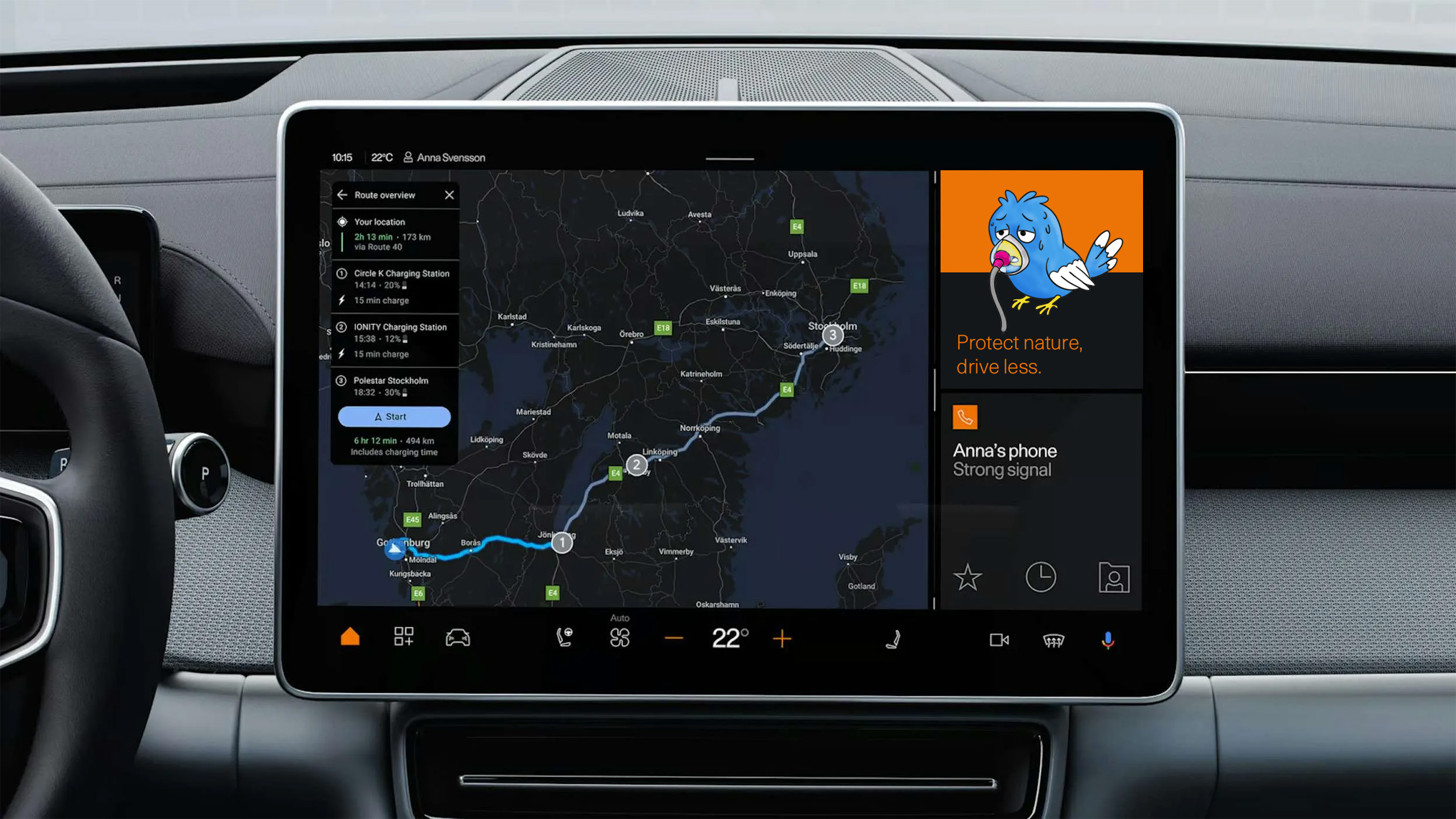
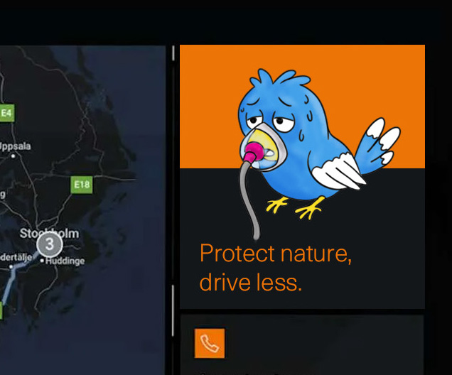
Planning a trip from Gothenburg to Stockholm, the driver opens navigation. Before pressing start, a sick bird appears beside the route, with the message: "Protect nature, drive less." It appears at the one moment the decision to travel is still open — nudging toward an alternative, like the train, instead of warning after the fact.

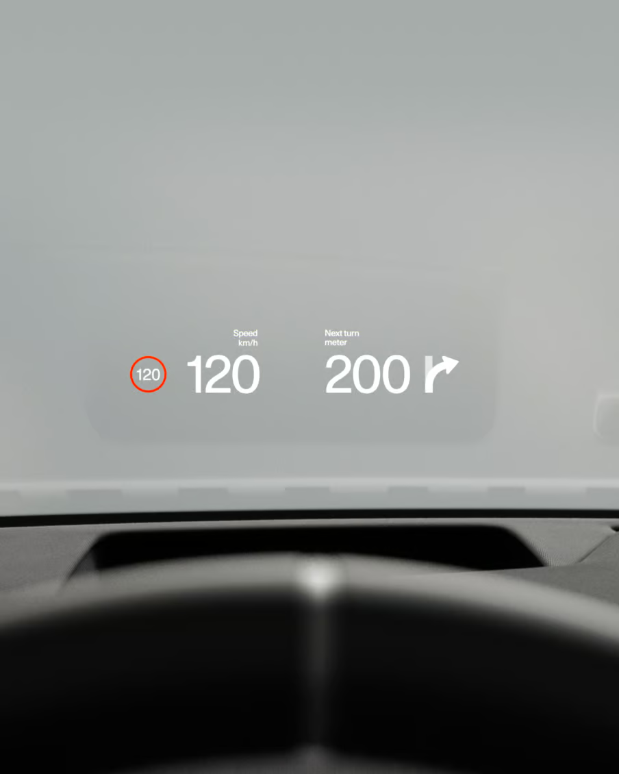
Polestar's head-up display projects real facts directly onto the windshield during high-speed driving. A fox struggling to breathe appears in that space — reminding the driver that speed itself has an environmental and animal cost, right where speed is visible.

What it could change
- Messages like these could get people to drive less, which is better for the environment and good for Polestar's image as an environmental leader.
- More awareness could help with tax breaks or sustainability incentives, and build trust with customers who care about the environment.
- If laws later require car companies to show drivers their environmental impact, this project shows one way to do that.
- Not everyone will drive less because of this, so Polestar could lose some sales — though every car maker would face the same problem.
- Not everyone wants to see this kind of message, or cares about the environmental impact. It could feel like moral pressure instead of just information.
- The same illustrations could get ignored over time if drivers see them too often. Changing them up (different animals, different scenarios) could help keep the message noticeable.
- There's a trade-off too: the idea also asks drivers to think about other ways to travel, like public transport, not just to drive more carefully.
This fits well with what critical design is about — it makes you stop and think, and opens up a conversation, which is exactly what I wanted. This project isn't telling people to stop driving. It's making the hidden environmental cost of driving visible, so people can reflect on it themselves.
One limitation is that the illustrations alone might not always be clear enough. Some people may not get why a tree is losing its leaves, or why a fox is struggling to breathe. A good next step would be adding a short line of text next to each illustration, so the message doesn't rely only on reading the picture correctly.
From awareness to better driving
The next step would be to move from raising awareness to encouraging better driving behaviour.
Driving cannot always be avoided, but the environmental impact of how we drive can sometimes be reduced. Instead of only showing negative consequences, a future version could use positive feedback and rewards to encourage more eco-friendly driving.
For example, smoother driving, lower energy use, or other eco-friendly behaviours could earn points, scores, digital awards, or positive visual feedback.
The goal would be to combine honest environmental information with positive encouragement, without distracting the driver.
Explore sustainable driving behaviour, existing eco-driving systems, driver needs, and what types of feedback may motivate people.
Explore different ways to communicate environmental impact and reward better driving behaviour.
Build an interactive Figma prototype showing how the feedback and reward system could work inside the car interface.
Let users interact with the prototype and check whether the information is understandable, motivating, and not distracting.
Improve the concept based on the testing results, and identify what works, what doesn't, and what needs more work.